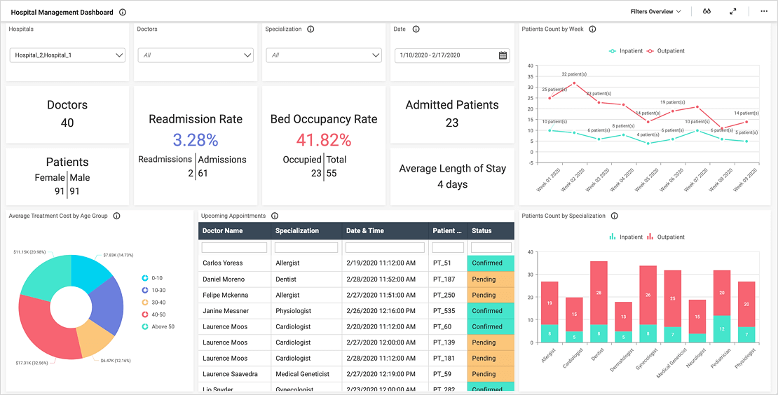


- Firstly, how many beds are occupied? Also, what is our average length of stay?
- Secondly, how do admissions and readmissions break down by month and DRG?
- Thirdly, how many episodes do patients experience?
- Fourthly, how does our patient population break down by urgency type?
- Finally, how do medical costs break down by DRG ?
Track Clinical Healthcare KPIs
Healthcare professionals rely on KPIs to track patient outcomes and ensure their teams are providing the best care possible. Schedule a demo to learn how a clinical variation dashboard like this one can help your team track healthcare KPIs and achieve its goals.
With the card widgets along the top of the dashboard, viewers can quickly see the number of beds occupied, average length of stay, and potential bed-day savings. Leaders can also see the number of episodes, discharged patients, deaths, and mortality rate. Finally, the Average Complexity card shows the percentage of patients who have complex cases.
The first row of widgets displays the average medical cost by DRG, admissions and readmissions by DRG, and patients by urgency type. Next, the Episodes by Month area chart breaks down the number of episodes by month and patients’ sexes. Similarly, the DRG by Complication stacked chart shows the number of patients in each DRG, along with the severity of their complications.
The line chart at the bottom of the dashboard outlines the number of patients admitted and readmitted in each of the past six months. Finally, the Patients Population by Gender pie chart shows how many male and female patients the hospitals have admitted.
Filter Your Data
Also, please note the filters along the top row of the dashboard. With these drop-down list boxes, users can filter data by date, facility, DRG name and type, complication, and urgency. This allows researchers to quickly and easily focus their analyses on specific sets of data.
Schedule a demo to learn how a clinical variation dashboard like this one can help your team track healthcare KPIs and work to achieve the best patient outcomes.